WebComponents/Tabview
Jump to navigation
Jump to search
The TabView
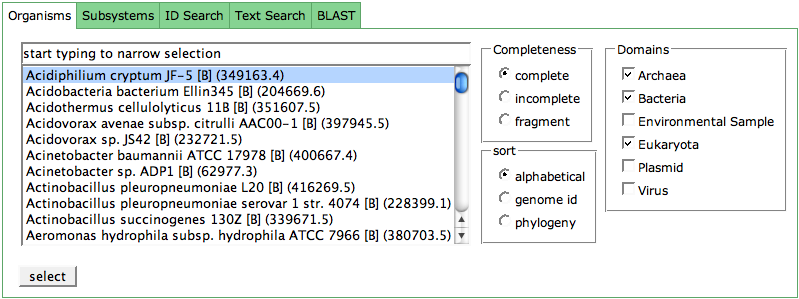
The TabView component is used on many pages in the SeedViewer. It is useful at places where you have different options to access data or you need to fulfill a task step-by-step.
The entire content of the TabView is loaded when you enter the page. Clicking a different tab only displays the data which was hidden before. At the top of the TabView, you can access the different tabs. In the example (SeedViewer Mainpage), the chosen tab is white, while all hidden tabs have a green header. Click on the green header to activate the respective tab.
