Difference between revisions of "SEED Viewer Manual/MultiGenomeCompare"
(→Result) |
(→Result) |
||
| (9 intermediate revisions by the same user not shown) | |||
| Line 26: | Line 26: | ||
[[Image:MCGResulta.png]] | [[Image:MCGResulta.png]] | ||
| + | |||
| + | The colored [[WebComponents/Table|table]] below shows the outcome of the bidirectional BLAST comparisons between each comparison genome and the reference genome, projected on the reference genome. The colors in the table depicts the '''Percent protein sequence identity''' of each gene to it's ortholog in the reference genome. The legend on top of the table describes the coloring. | ||
[[Image:MCGResultb.png]] | [[Image:MCGResultb.png]] | ||
| + | |||
| + | The first three columns of the table refer to the chosen reference genome ('''Contig''', '''Gene''' and '''Length'''). The Gene ID links to the | ||
| + | [[SEED_Viewer_Manual/Annotation|Annotation]] page for the feature. | ||
| + | |||
| + | The best BLAST hit of the query feature in the comparison genome is shown in three columns in the table ('''Hit''', '''Contig''' and '''Gene'''). The color of the hit is determined by the percent identity of the query and the hit. No color means there is no hit. The '''Hit''' column contains a '-' (no hit), 'uni' or 'bi'. The '''bi''' stands for ''bidirectional best hit'', meaning that the reverse hit from the comparison genome to the reference genome is also the best hit (That's not always true if a genome contains many close paralogs for a feature). If it's not a bidirectional hit, it shows '''uni''' for uni-directional. Each feature ID is again linked to the feature's [[SEED_Viewer_Manual/Annotation|Annotation Page]]. Hovering over a cell in the table will show a tooltip with some information about the feature. | ||
| + | |||
| + | The contents of the table can be exported in ''tab-separated format'' using the '''export''' button on top of the table. The filters below the buttons refer to the percent identity for the features of each genome. You can choose to filter the table for the percent identity above or below a certain value for each genome, and also in combination. Use the button '''clear all filters''' to reset the table. | ||
[[Image:MCGResultc.png]] | [[Image:MCGResultc.png]] | ||
| + | |||
| + | The circular image right to the table is a whole genome view for the reference genome. Each circle represents a projection of a comparison genome to the reference genome, in the same order as in the table. Keep in mind that the table as well as the graphic only shows features of the comparison genomes, that are hit by the reference genome. The order of the features is determined by the reference genome. | ||
| + | |||
| + | If you click on a line in the graphics, the table will update and show the area that was clicked in the graphic. The red circle in the graphic determines the area the table currently displays. | ||
[[Image:MCGResult2.png]] | [[Image:MCGResult2.png]] | ||
Latest revision as of 04:21, 2 December 2008
Multi Genome Compare
This page provides a way to compare a chosen organism against on or many others on the basis of the feature sequences (protein).
Start the computation
To start a Multi Genome Comparison, you have to fulfill three steps:
1) Select Reference Genome
The reference genome is used as a basis for the comparison. All selected genomes (step 2) will be projected on this one. Click here to see how to select an organism.
2) Select Comparison Organisms
You can select maximal four organisms to project on the reference genome.
3) Compute
Press compute to start the computation. This may take while, as the system computes a bidirectional BLAST comparison of each genome to the reference genome.
Result
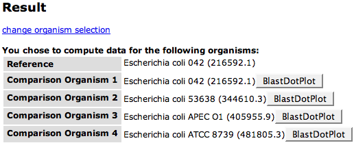
At the top of the result page you will see a list of the genomes involved in the comparison again. After each comparison genome, there is a button BlastDotPlot that leads to a dot plot of the BLAST comparison between the comparison organism and the reference genome.
You can use the link change organism selection on top of the table if the selection does not fit.
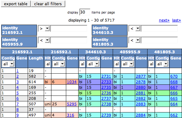
The colored table below shows the outcome of the bidirectional BLAST comparisons between each comparison genome and the reference genome, projected on the reference genome. The colors in the table depicts the Percent protein sequence identity of each gene to it's ortholog in the reference genome. The legend on top of the table describes the coloring.
The first three columns of the table refer to the chosen reference genome (Contig, Gene and Length). The Gene ID links to the Annotation page for the feature.
The best BLAST hit of the query feature in the comparison genome is shown in three columns in the table (Hit, Contig and Gene). The color of the hit is determined by the percent identity of the query and the hit. No color means there is no hit. The Hit column contains a '-' (no hit), 'uni' or 'bi'. The bi stands for bidirectional best hit, meaning that the reverse hit from the comparison genome to the reference genome is also the best hit (That's not always true if a genome contains many close paralogs for a feature). If it's not a bidirectional hit, it shows uni for uni-directional. Each feature ID is again linked to the feature's Annotation Page. Hovering over a cell in the table will show a tooltip with some information about the feature.
The contents of the table can be exported in tab-separated format using the export button on top of the table. The filters below the buttons refer to the percent identity for the features of each genome. You can choose to filter the table for the percent identity above or below a certain value for each genome, and also in combination. Use the button clear all filters to reset the table.
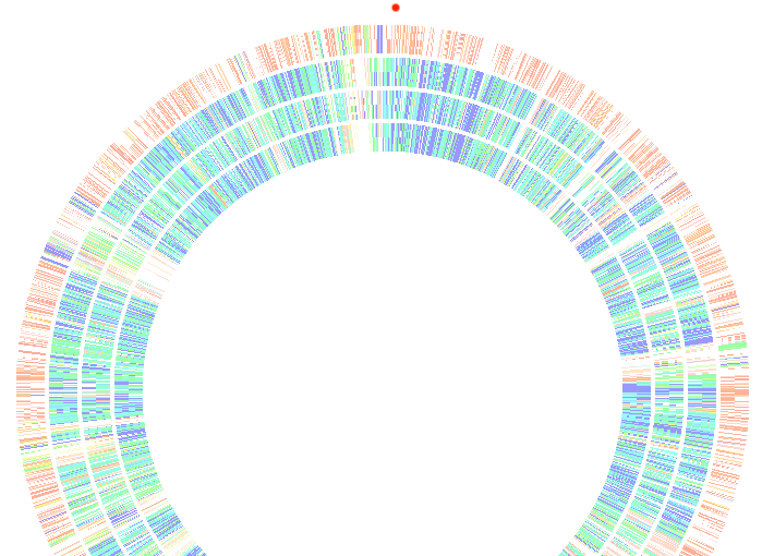
The circular image right to the table is a whole genome view for the reference genome. Each circle represents a projection of a comparison genome to the reference genome, in the same order as in the table. Keep in mind that the table as well as the graphic only shows features of the comparison genomes, that are hit by the reference genome. The order of the features is determined by the reference genome.
If you click on a line in the graphics, the table will update and show the area that was clicked in the graphic. The red circle in the graphic determines the area the table currently displays.


