Difference between revisions of "WebComponents/Table"
Jump to navigation
Jump to search
(→Table) |
(→Table) |
||
| Line 3: | Line 3: | ||
The Table component has a large number of functionalities that can be used to access data that can be displayed in tabular form. Features of the table component are '''Browsing''', '''Sorting''', '''Filtering''' and '''Export'''. | The Table component has a large number of functionalities that can be used to access data that can be displayed in tabular form. Features of the table component are '''Browsing''', '''Sorting''', '''Filtering''' and '''Export'''. | ||
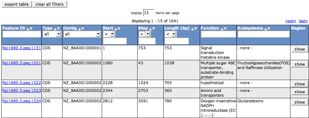
| − | A table consists of a header row (here in dark blue) and the rows that contain the data. | + | A table consists of a header row (here in dark blue) and the rows that contain the data. In some cases the header row can be supplied with a supercolumn to group columns. The header cells contain the functionality to sort and filter the row data, as described below. |
| + | |||
| + | The rows are colored in two different colors for better visibility (here white and light grey background). If you hover over a row, it will be highlighted in dark grey. | ||
| + | |||
| + | |||
[[Image:Table1.png]] | [[Image:Table1.png]] | ||
Revision as of 04:58, 26 November 2008
Table
The Table component has a large number of functionalities that can be used to access data that can be displayed in tabular form. Features of the table component are Browsing, Sorting, Filtering and Export.
A table consists of a header row (here in dark blue) and the rows that contain the data. In some cases the header row can be supplied with a supercolumn to group columns. The header cells contain the functionality to sort and filter the row data, as described below.
The rows are colored in two different colors for better visibility (here white and light grey background). If you hover over a row, it will be highlighted in dark grey.


